
Home » Game Design
Category Archives: Game Design
Big Game Project Week Eight
The last week of production is upon us, this weekend Gotland Game Conferance finally happens and the game will be displayed on the show floor.
Before I talk about this week I must mention what I forgot to write about last week.
The air animations for Hoppy and Sticky has been changed so that they more closely resemble slimes in their movement.


I had to work around the fact that I did not rig them to actually be able to do this, it was an afterthough from the Lead Designer. But I think it worked out pretty good.
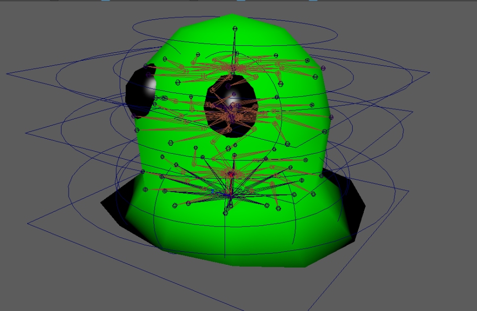
This week I had to redo some of the animator because the work has disappeared for some reason when I pushed it up to the team using SourceTree. But it went very fast this time.
Then I made some graphics for menus and such. Here are some examples.


Also the trailer was finished this week thou I did not work on it
Please give it a look
Next off to Gotland Game Conferance!
Big Game Project Week Seven
Time to get my work to actually work in the game engine. I have never used the animator of Unity earlier so I had to spend some time learning how it works. I also had to ask for code specific for what I am doing, parameters that I can use to control the animations within the animation controller.
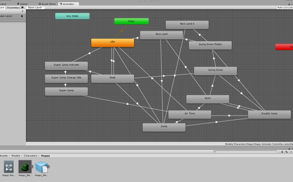
I started with Hoppy to lay down the basic movement animations idle, walk, jump and double jump since all characters share these states. After working out some bugs I find the result more satisfying than I initially thought.
Next up is Sticky
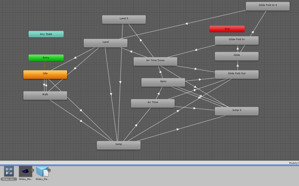
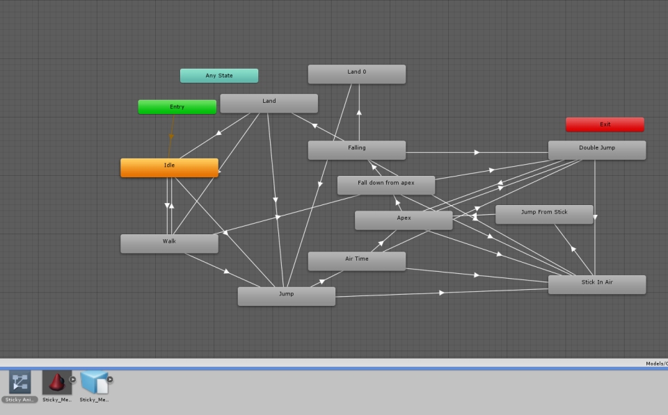
And to finish things off Glidey. I found that the work went more smoothly the more I did it so fixing Glidey took half the time of Sticky and Sticky took half the time that Hoppy took.
After tweaking and testing I think I have managed to make it work without it feeling akward or weird.
But I have one bug that I can not work out. During specific conditions the animations get stuck in the “up in the air” animation. The character never clamps to the ground and for some reason the Y-axis ends up at -30 and thus the animation state never changes to “land”. I will leave this in because it does not happen to often and will not impact the experience, I hope…
Big Game Project Week Six
So this week the team decided on the final name for the game: Adventures In Space And Slime. This is the logo made by your truly.
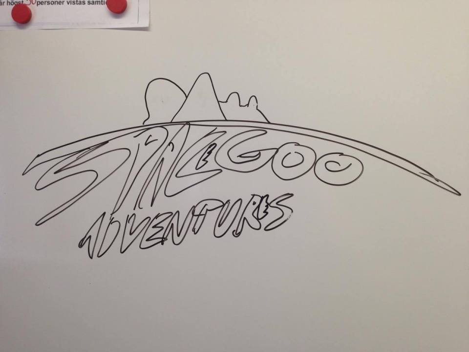
Began with a rough sketch, blocking out ideas.
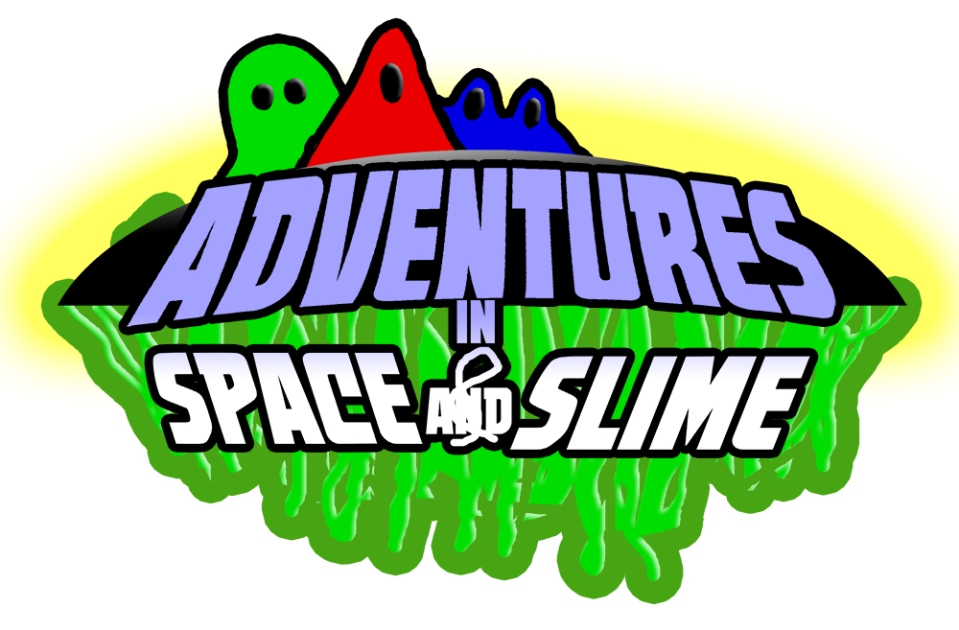
Updated version that is a bit more fleshed out. We wanted slime in the logo.
![]()
After recieving feedback this is what I ended up with.
Welcome Adventures In Space And Slime!
Big Game Project Week Five
After rigging the last two characters last week it is now time to animate them as well.
Since all of the characters has the same basic movement I will just do the animations for the first character (Hoppy) again.
But with Glidey I have to make a few modifications since he is flat instead of round.

Sticky Walkcycle

Sticky Idle

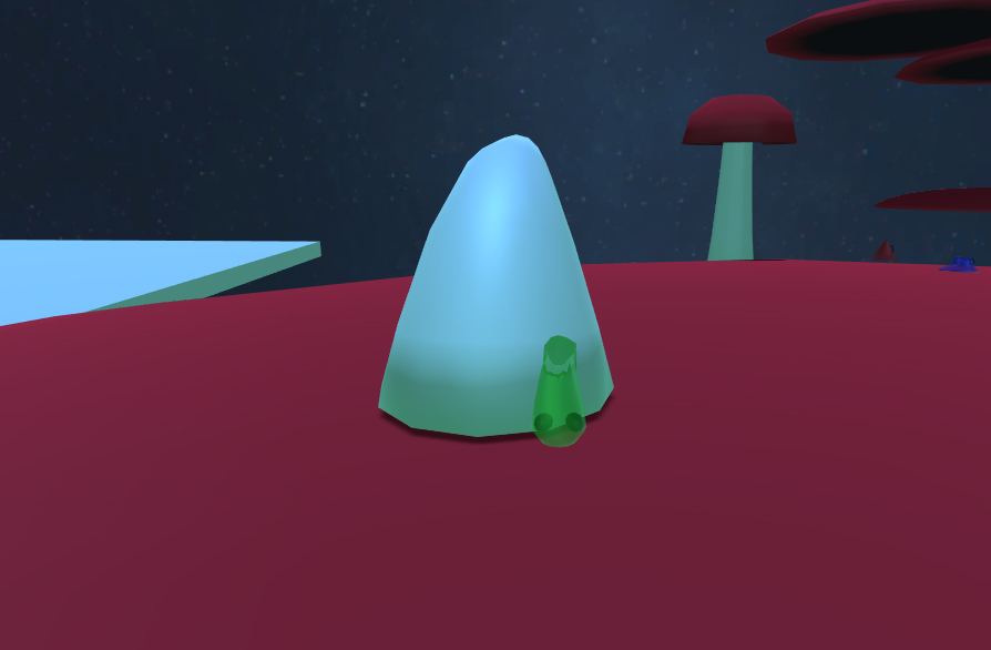
Sticky jumping and landing. His stick abilitys animation looks the same as when he lands.

Glidey jump.

Glidey walking.

Glideys glide. I had concearns last week but I find that it works.
Now I just have to implement this in to the game engine that we are using and I have little to no experience with working inside Unity.
Big Game Project Week Four
The project is moving along nicely. Though I am not particularly accustomed to the Unity animator yet I have to leave it for the time being. I have to more characters to rig before i continue.
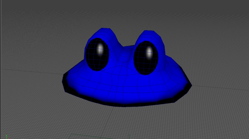
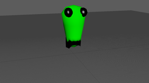
The first character I wrote about was the green one know to the development team as Hoppy. The other two are Sticky and Glidey. Obviously they are all named after their respective special abilities. They can all move and jump but Hoppy can double jump, Sticky can stick to walls and and Glidey can glide through the air.
Sticky was really easy to rig since I could use the same skeleton and control objects as I used for Hoppy with just a few modifications.
But I had to rebuild the mesh since it originally was a character named Grabby who had a long arm that could grab things that got scrapped during the pre production phase.
Glidey on the other hand was a nightmare to update.
Since his mesh has a different shape than the other two I had to rebuild it. Here as well a had a mesh done for the pre production phase but it was horrendous. Edge loops all over the place and not at all optimized for animations.
When I was done and put him into the game world I realized that som edges caused problems with the lighting of the level so I had to continue to rework him until these problems were gone.
Then with the rigging I had to create a new rig since his mesh differed too much from previous meshes. This also took a while because I had to rethink my previous work. I also had to accommodate for his special ability to fold out like a wind sail.
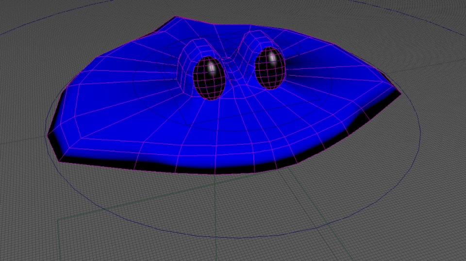
Once he is in the game engine we will see if my thought were correct or not.
Big Game Project Week Three
Finally! After creating a skeleton and a control rig it is finally time to do the most fun part. Imbuing the character with life.
The game engine that is used for this game is Unity and since I have little prior experience working in this engine I chose to keep the animations simple for this first step. I know that there are advanced options using a blend tree but until I have studied this I will keep to the basics.
A simple jump
Some air time

And a landing. This one has a few more frames than the jump because I did not look like an actual landing otherwise.

Big Game Project Week Two
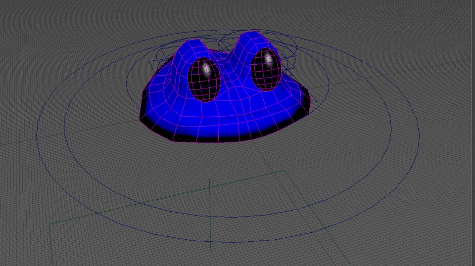
After last week’s skeleton placement the time has come to enable a intuitive control over said skeleton. It would be very cumbersome to be forces to animate every bone in the character by hand.
I used what is called NURBS curves in Autodesk Maya to enable me to circumvent this problem and create Control objects for the skeleton rig, using tutorials online and a book I found called the art of rigging. I found this site particularly insightful: https://courses.cs.washington.edu/courses/cse460/05sp/links/Rigging/basic_character.html
While not rigging a humanoid character the basic principle is the same.
Placing the control objects to correspond with the part of the skeleton that I want to control it.
The most challenging part with creating a control rig is how to place the constraints between the Control object and the skeleton. But once I figured it out it is actually quite logical. The NURBS are placed in a hierarchy beside the skeleton so that the objects lower in the hierarchy follow the ones higher up thus maintaining their relative positioning to each other.
Then using point constrain and orient constrain to lock the into place to the joint.
The only difference is the stretch control. This one has a parent constraint instead because it is the only control that uses scaling as the desired control method while the other ones uses Rotation and Translation.
Another thing to make it easier to control is using ikHandles between joints. This creates a “rubber band” between the joint so that the lower joint in the hierarchy controls the ones higher up. Imagine a humanoid arm. Without the ik the arm has o be animated by first moving the shoulder, the the elbow and lastly the arm. With ik enabeled the animator just has to move the hand and the rest of the arm will follow.
The finished result may look intimidating but it is better that the alternative.

Big Game Project Week One
The time has come to participate in a course where I can actually make a game and not just graphics for one. That is something I have felt is lacking the last few months.
I am working on a game that is so far called SpaceGoo Adventures. It is about three? slime creatures with different abilities traversing a world to find parts for their broken teleporterthingie. It is a 3D plattformer collectathon reminicent of old Nintendo 64 games like Mario 64 and Banjo Kazooie.
My job is to breathe lif into these characters through animation. The last graphics course of my education focused on 3D character animation and there we used Motion Builder. Since the character for this game are slimes it is not preferrable to use Motion Builder since it is mainly for humanoid character. Thus I had to figure out how to rig and animate in Autodesk Maya.
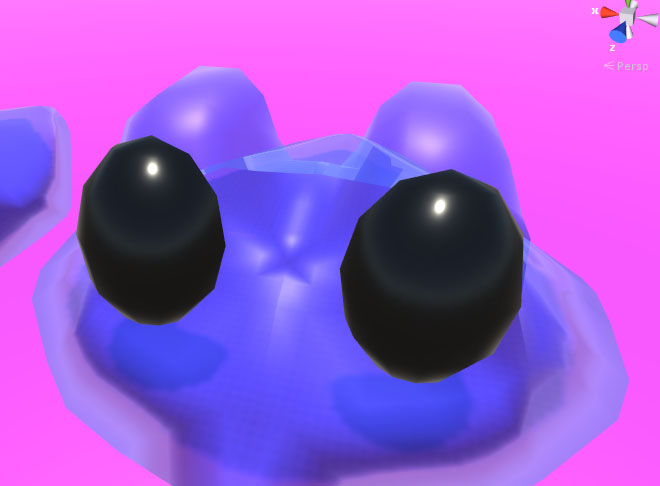
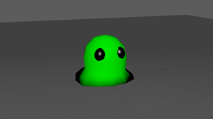
As with all animation you need something to animate so I started out creating one of the characters dubbed “Hoppy” for his special ability to double jump. Just a basic round blob. My team is going for a low poly aesthetic so I do not have that many polygons to work with.
This is Hoppy.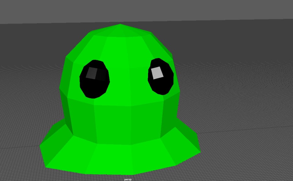
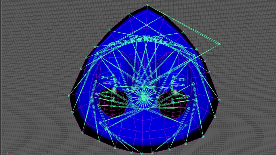
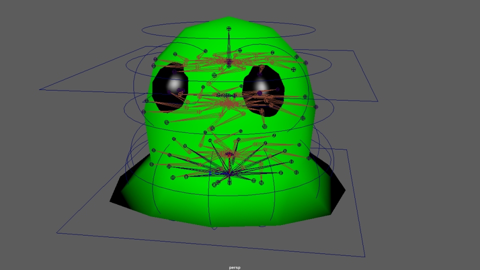
First I had to figure out what kind of range of movement I wanted out of this critter. So I sat down and experimented with the configuration of the skeleton. I want him to be able to squash and stretch and wiggle to sell that he is made from slime.
Controllig the different edge loops and the eyes and what I call a hinge joint in the middle for the squash and stretch.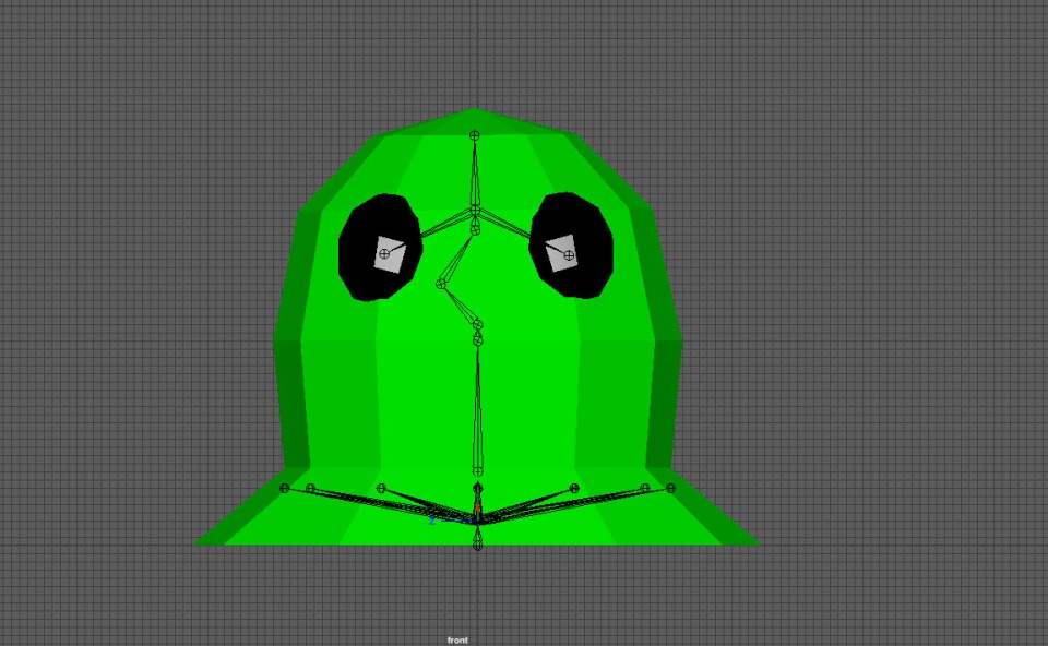
To be able to make him wider or thinner I created this shape. All of the arms will eventually be controlled with ikHandles.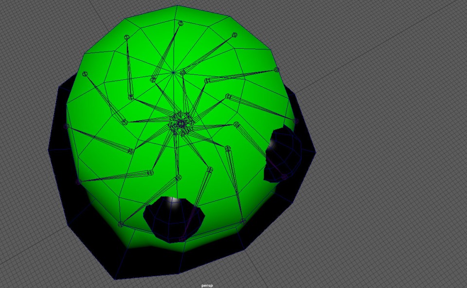
Here we have the finished skeleton where all of the edgeloops can be controlled to make Hoppy wider or thinner as need arises. I will probably realize later that I missed something in this process since I have never done it before. But that is why I am here, to learn.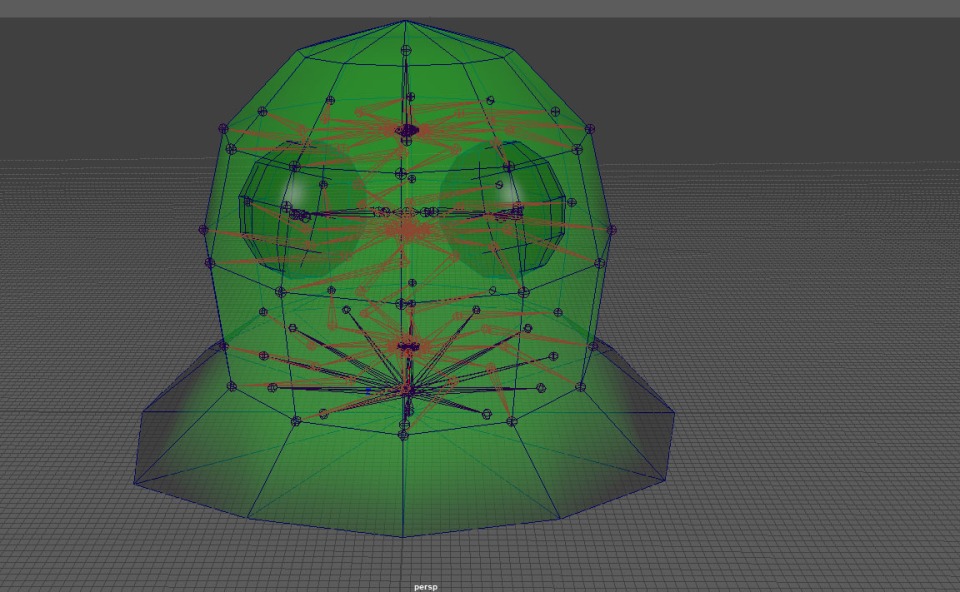
2D Game Project: State Flowchart
So another week is soon at its end and the game is coming along nicely. I sent it to a couple of friends to try it out and we also had a game testing session with the other groups from our class. Not only did we get a lot of feedback for our game we also had the opportunity to test the other projects. I personally is very impressed with the lot of them. Its really insane that we all have come this far in just a few short weeks when most of us never made a game before. I could also see that the project I’m working on is not far behind the other, quite to contrary actually. But it was an even batch of things. Looking forward to see the completed games.
Now on to my stuff.
I have made a flowchart for the different states needed for the game. I have also made placeholder images for these states so that the programmers can make it work more like a real game.

The flowchart shows the different states of the game like the start screen, options menu, the actual game play state and pause menu and so on. It also had colored lines with arrows that shows what option in the menus leads to what state. Also if one looks at the line to the high score and options states from the start menu one can see that there are to arrow that point in both directions. This is to indicate that it is not a one way street. Because it would be really worthless to be able to get to the options menu and then not be able to go back and actually playing the game. It is the game we are here for, right?
The thought process behind the different states are not so hard. We asked ourselves, what do we need? Well the “game state” where the game is taking place is good to have. Hard to have a game without it. This will not be covered in this post.
The start menu was conceived as a homage to old school arcade games. Since this is suppose to be a space shooter it needs to have a start screen where the player can check options (I will get back to this) and highscore since this needs to be in the game. I wanted to have a “insert coin” just to have that true retro feel but eventually decided against it since there are no actual need for coins. Please note that all of the following pictures are placeholder images. But the final design will probably look quite similar.

Every game needs an options menu, that is kind of standard. But what would be in the options menu? There are no options to change the graphics and no subtitles. It was decided that the player would have the ability to turn off sound and sound FX. Also the player would be able to change the control scheme if needed. I know from personal experience that when creators use layouts that make less sense the lack of customizability can be frustrating.

The pause state is very good to have since the player might need to take a pause from the game for some unexplicable reason.
To make the game experience easier a couple of options were placed here. The ability to go back to the start menu of course. If the player want to quit the game or start from the beginning this has to be available.
Reload checkpoint. Maybe the player realises that it is impossible to continue, maybe the energy for the rockets is too low or maybe some kind of glitch makes the game impossible to complete, this is a good option to have so that the player does not have to start from the beginning. To minimize frustation for the player.
Also of course the ability to go to the options menu if something needs to be changed.

These are the most importatn states for the player. This game also features a intro and outro cinematic which are two different states. A reload last checkpoint state that has no placeholder really since it is invisible to the player. The end highscore that shows the point earned during the course of the game and last but not least the game over state. And the credits so that people know who made the game.
We were told to have a very negative game over screen and this is what I came up with. Im actually quite fond of it. Aliens attacking and killing in a zero gravity environment. Ofcourse there will be blood floating around.

I am looking forward to developing these states further so that the esthetics match the rest of the game.
Over and out for now
2D Game Project: Player Bullet Design
A few weeks ago we finally started to make an actual game. A 2D “space shooter”. The definition of space shooter is that the player Avatar has to be able to shoot and that gravity is not allowed. So no 2D platformer here.
From the available concepts to choose from my group, named Team 5, chose a game called “The Last Signal”. Compared to the other concept available this is a game that actually takes place in space! The player takes the role of an astronaut who is trapped in a spaceship that has been overrun by an alien threat. Since there is no gravity the player controls the character by controlling two thrusters located on the backpack. Fire up one and the avatar rotates, fire the other and the avatar rotates in the other direction. Fire up both and the avatar takes off straight ahead. This control scheme together with the ability to shoots the aliens will hopefully become an intriguing game.
Since this is a shooter there needs to be some kind of projectile involved. This is what I have been doing. Since the character is carrying a plasma rifle the lead designer and I looked at different kinds of plasma and settled on the look of these glass balls that you can buy in stores that has what looks like lightning in them that is drawn to your fingertips if you place them on the glass. I have no idea what they are called. The lead designer told me to capture the feel of that ball but instead of glass surrounding it some kind of futuretech forcefield would be utilized.
I looked at photos for reference and started working.
I began with the layer furthest down, that layer represents the force field, and worked my way up. A clear core where the energy is emanating from streaming out to the outer shell. I made all these things in separate layers in photoshop so that they can easily be animated in later stages of the production.
This is what I finally came up with.

But! Since I worked in a greater resolution than the final product (80×80 pixels) a lot of the detail disappeared when it was shrunken down to the correct size (20×20). Also when I saw the projectile being used in the game engine i realized that it will probably have to be tweaked because it was a bit hard to read both because of color and size. More testing is required to determine where to take it from here.
There is also another kind of projectile in the game, something called Compressed Plasma Rounds (CPR). These are smaller and a bit differently colored than the normal projectiles.
They look like this.

Lots of work is left but I am confident that it will pay off in the end.
